
crescence
brand, website and app
- services
- brand identity, web design, product design
- year
- 2026
the result
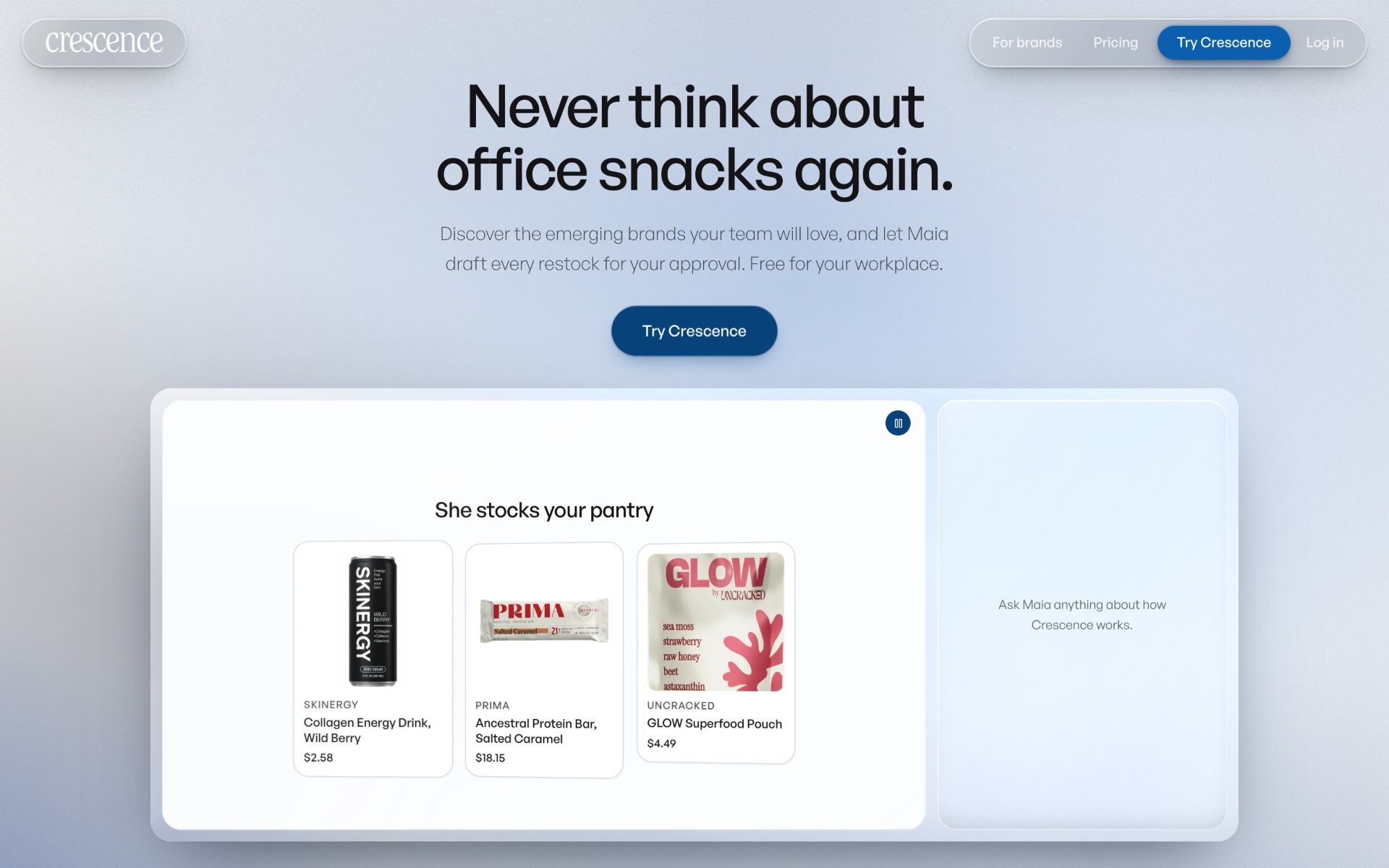
one system from the mark to the last screen of the app: the same blue, the same type and the same glass wherever crescence appears, live at crescence.co.
the brief
crescence keeps office pantries stocked with snacks and drinks from independent brands. it needed to look like one company everywhere: on the web, in the app and in front of the trade.
one system from the mark to the app, live at crescence.co.
the brand
a serif wordmark for warmth, one deep blue for trust, and a sans for everything that has to be read.


the website
the whole story in one scroll: maia stocks the pantry, the team votes, one delivery arrives.
visit crescence.comake something like this
an ai agent · a person replies within a day